How to creat stunning visualisations using R
What is data visualisation?
✅ Thank you for completing the survey!
Put simply, data visualisation is the pictorial representation of data. Any data set can be understood at a glance by representing it on interactive charts and graphs. This presentation method is employed everywhere around you, right from statistical graphs in textbooks and academic papers to colourful infographics in newspapers. As technology has progressed, we’ve been able to add increasingly more specifics and data, and with more data arises the need for accurate and appropriate visualisation techniques. That’s where ‘R’ comes in handy.
What is R?
R is a language developed primarily for statistical computing and data analysis. Data analysis and data graphics go hand in hand so it’s imperative for a language of R’s nature to have support, which will help it employ some amazing graphic techniques for data visualisation.
Programming to create visualisation? Is R user friendly for students?
R, since its introduction, has become quite popular not only among the PhD holders in Data Science but also amongst mainstream users in need of a common platform for computing and visualisation. In this workshop, we’ll get you started on some simple data visualisation techniques using R, which will serve as an adequate platform to develop visualisations that are even more advanced. For first time users of programming languages: Do not be afraid. The idea of coding from scratch can be intimidating, especially if you’ve never used programming languages before. Remember that every line of code is simply a written equivalent of a keyboard shortcut in a sense. It performs a task and these commands can mostly be looked up in a book or online.
What are the advantages of using R over MATLAB?
R has some distinct advantages. Since it’s a free software service released under the GNU license it’s free! This gives it a huge advantage over commercial software such as MATLAB, which are really expensive especially for students and small enterprises. Because of its Open Source nature R attracts a host of talented developers which means awesome support, documentation and user defined packages for diverse needs. R has some amazing packages to unlock a variety of complex and useful data visualisation techniques.
What else can R do?
Besides creating stunning visualisations you can also easily perform run-of-the mill data analysis. There’s good support for computations regarding statistics and probability, and support for machine learning and data mining is getting better.
.jpg)
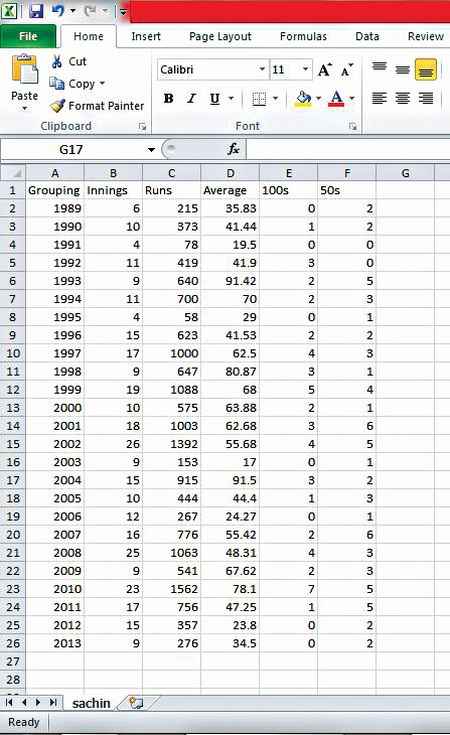
A screenshot from the data sheet where Sachin Tendulkar’s records are stored. Source: stats.espncricinfo.com
Installing the IDE
One of the best and most robust IDEs for R is RStudio. (An IDE or integrated development environment is a facilitator that helps you communicate effectively and intuitively with the programming language). It comes bundled with R software and basic packages, and can be installed on Linux, Windows or Mac with the single click of a button.
The installation in Windows/Mac is a routine procedure as with any other software. Download RStudio Desktop, run the .exe file and follow the procedural steps. While in Linux one has to install R via the terminal (type ‘sudo apt-get install r-base’) and then install RStudio separately by selecting it from the software centre.
Basic layout – as user-friendly as it gets!
The home screen is an arrangement of four panes, each of which can be expanded to fill the screen whenever required. The top left window is where the codes are written and run en masse, however this part is not important to our tutorial. The top right window maintains a history of all the commands written. The bottom left window is the ‘console’ where you enter commands and see the results (if any) in the bottom right window.
Select and read data
Let’s now create a visualisation. Here’s some data from Sachin Tendulkar’s batting record each year (Source: stats.espncricinfo.com) pasted in an Excel sheet as shown here:
Click on File > Save as > Save it in the CSV (Comma Separated values) format in My Documents (the default location from which RStudio inputs files)
In the RStudio console (bottom left), type the following:
sachin<-read.csv(‘sachin.csv’,header = TRUE);
This will ensure that sachin is now a data set with rows and columns. Type ‘sachin’ and press [Enter] to view the table with its headers.
The default packages allow some plotting in R. For example, type the following:
qplot(sachin$Grouping,sachin$Average);
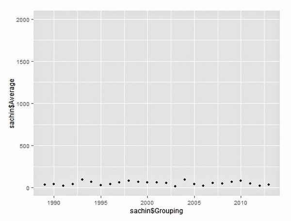
Average annual score plotted versus every year – heavily scaled up graph. While there seems to be remarkable consistency, it does appear to push the average score closer to zero
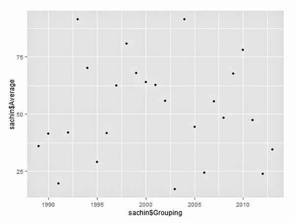
You’ll find a plot of the average scores by Sachin in each year, with the ‘Grouping’ column showing along X-axis and ‘Average’ column showing along the Y-axis. It might seem a little haphazard so change the scales until you find a graph that works for you. For example:
qplot(sachin$Grouping, sachin$Average, ylim = c(0,200));
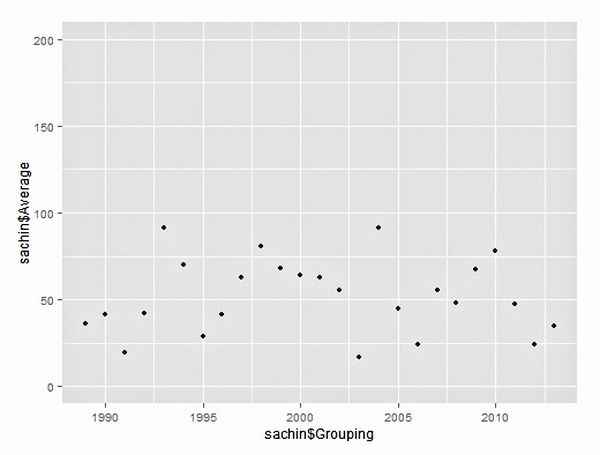
Average annual score plotted versus every year – the default setting
Average annual score plotted versus every year – slightly scaled up graph. Notice how everything seems to appear a lot more ‘averaged’ and ‘flattish’
qplot(sachin$Grouping, sachin$Average, ylim = c(0,2000));
These produce radically different visualisations compared to the first data set!
To unleash the full potential of R’s graphing capabilities, employ the ggplot2 package. Ensure you have a working internet connection and type:
install.packages(“ggplot2”);
library(ggplot2);
You can now use all the functionalities of ggplot2.
ggplot2 has two basic components: aesthetics, which is all the data and elements, which is the kind of visualisations you want – viz bars, lines, heat maps, etc.
In the console, let’s try the following:
ggplot(sachin, aes(Grouping, Average)) geom_point();
This yields the same graph as the one shown above with the difference being the ability to customise. Type the following:
ggplot(sachin, aes(x=Grouping,y=Average,colour = X100s)) geom_point(shape=15, size = 6, alpha = 0.8)
This gives a plot of averages versus grouping, except each point’s shade is determined by the hundreds – lighter the shade, more the number of centuries that year. The shape and size can be changed accordingly, and the parameter ‘alpha’ determines the intensity of colour. Replace ‘X100s’ with ‘X50s’ and you’ll get the point shaded according to the 50s scored.

Tendulkar’s average annual runs tally shaded according to number of 50s scored
ggplot(sachin, aes(x=Grouping,y=Average,colour = X50s)) geom_point(shape=15, size = 6, alpha = 0.8)
This brings some new insight into the dataset – for example, it shows that the more 100s he scores, the higher is his average. However, his highest average runs in one year need not have the maximum number of centuries – indicated by the lighter points occupying a band of points just below the maximum score. Even with the 50s (replacing X100s with X50s), you see a similar pattern although maximum runs in a year is also very close to the year with maximum number of fifties.
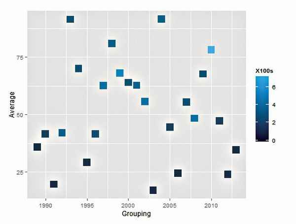
Tendulkar’s average annual runs tally shaded according to number of 100s scored
This sort of an analysis, called ‘correlation’ is central to every aspect of study – from cricket stats to the population of tigers in a jungle.
There are several built-in functions and dozens of sources from which you can get interesting plots and analyses.
Interface and Interfacing
Each of these plots can be saved in PDF or JPEG formats with the simple click of a button. Just click on the ‘Plots’ tab in the bottom right window, select ‘export’ and choose the required option. You can even adjust the size and aspect ratios before saving.
There is extensive help available for R. You can search online forums for commands and codes, or if the command is known, a ‘?’ followed by the name on the console will give all the information on the respective command.
R has one of the largest numbers of packages and these are still growing. Several languages and GIS applications can be integrated with R, apart from visualisation. Basic R charts and graphs are the basis for several infographics, which you can then polish up with some art to improve visually appeal.
You can even make interactive graphs with given data, similar to the one just described.
.jpg)
EU27 trading data from the BEC group since 1999 – a beautifully coloured graph for a seemigly drab data set!
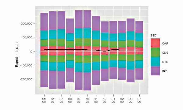
http://www.rstudio.com/shiny/showcase/ has several such examples. RStudio’s package ‘Shiny’ makes it super simple for you to turn analyses into interactive web applications that anyone can use. It lets you incorporate parameters such as sliders, dropdowns and text fields, and gives you control over the number of outputs you want to add such as plots, tables and summaries. Shiny also provides a guide to creating such interesting apps.
.jpg)