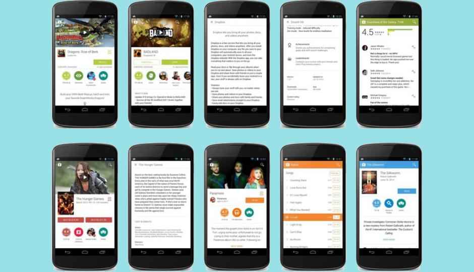
Google Play for Android updated with new Material design
Google Play Store 4.9 update, brings a new Image-Rich UI inspired by Material Design.

Google has begun rolling out a new and image-rich Google Play store for Android, inspired by its new Material design philosophy. Google says the new design will be rolled out gradually over “the coming days,” so you may need to wait before it arrives on your device.
 Survey
The update to the Google Play Store brings the virtual storefront to version 4.9.13 and includes very noticeable visual changes. When users access any particular Play Store entry, whether its apps, video, audio or written content–they are directed to a new image-rich listing page. Cover art has a larger role, and details like rating overviews and genres have been moved into easy-to-read icons in the update.
In addition, the Play Store listings now feature a floating action bar menu which fades into place when scrolling down any entry. Google+ section has become more prominent in the update and a “What’s New” section has also been added. Users can open the Whats New feature by tapping on the screen or close it by clicking the “x” or scrolling up past the content. Apart from this there has been no changes to the basic navigation and most other parts of the Play Store seem untouched.
Google has introduced its latest design guidelines known as ‘Quantum Paper’ or Material Design at the Google I/O conference last month. The internet giant has already launched Material Design homescreens for Google’s Docs, Sheets and Slides services on the web. According to reports Google is planning to unveil its Android L and Material Design in the fall.
Source: @GooglePlay
Silky Malhotra
Silky Malhotra loves learning about new technology, gadgets, and more. When she isn’t writing, she is usually found reading, watching Netflix, gardening, travelling, or trying out new cuisines. View Full Profile