Living with Office 2013

Not that I’d recommend that any normal user do this yet, but I’ve spent the last couple of weeks using the pre-release version of Office 2013 on the consumer preview version of Windows 8 as my primary computing environment.
While Windows 8 does take some getting used to—I’ll focus more on that after I get my hands on the RTM version later this week—what mostly surprised me about Office 2013 is that it is merely a subtle change in the way it works. There are plenty of ways to use it differently than the existing versions of Office, and you can buy it in different configurations, but I think most traditional desktop and laptop users of Office will be pleasantly surprised. It certainly doesn’t come across as the big change in usage patterns that the introduction of the “ribbon” menu was for Word, Excel, and PowerPoint in Office 2007 and for Outlook and other components in Office 2010.
Much has been made of Microsoft’s integration of Office with the cloud and its Office 365 subscription service, which lets consumers and small businesses buy the service on a monthly basis. It certainly makes it easier to store documents in the cloud on Microsoft’s SkyDrive service, and from there, you can access your documents from the free (but comparatively limited) Office Web Apps. While that’s great for occasional use, my guess is most people will want still to use the traditional desktop version, in large part because it’s familiar but also because it feels a bit more snappy and responsive, and has more features.
Microsoft announced four versions of the Office 365 subscription plans (although not pricing), including a Home Premium version with Word, PowerPoint, Excel, Outlook, OneNote, Access, and Publisher plus 20GB of SkyDrive storage; two small business versions for up to 10 and up to 25 users, which add hosted SharePoint and Lync; and an enterprise version, which includes server versions of Exchange, SharePoint, and Lync. The company will also offer a traditional software license, Office 2013, though it hasn’t disclosed packaging or pricing yet. Either way, the desktop versions of the software are the same whether you get them through the monthly subscription or through a traditional license.
At least in the Home Premium version, by default, all the Office components want you to sign in to your Microsoft account and share your documents in Microsoft’s SkyDrive service, which means they are synchronized and available on any computer you have. I’ll admit that’s certainly a nice feature. I can be working with a document on one computer, then go to another and have the same document in the same place. The same is true, of course, if you use the Web versions of the applications, though they are less full-featured. This has been possible through Web-based document services (such as Google Apps) or synchronization services (from Dropbox to Box to SugarSync) for a while, but it’s all thankfully seamless within Office. I was also pleasantly surprised to see the synchronization working seamlessly with Windows Phone (7.5), with documents going back and forth nicely.
Still, if you want, you can save your documents locally, to a server, or to SharePoint. I suspect a lot of business users will do that and enterprise users will not want to use SkyDrive. I’ve been mostly using the core desktop applications, pretty much in the way I always have, and although I’ve found a number of bugs (this is, after all, pre-release software), I’ve found a lot to like.
The basic user interface of all the applications hasn’t changed all that much, but it is simpler and less intrusive. In general, you start out with the same basic “ribbon” interface of the Office 2010 versions, but with some new options. One is a full-screen mode that removes the menu and ribbons from the top of your screen altogether, giving you a blank screen to write or work on. You just need to click on the top of the screen (or touch it, if you have a touch screen) to bring the menu back. It’s a nice way of giving you more space, and particularly useful on a smaller screen such as a tablet, but one I’ve liked while using a laptop as well. Another option called Touch Mode puts a bit more space between the menus, making the products work better on a tablet or with a touch screen. It’s not a big change, but it does help, especially in navigating through Outlook on a tablet.
These are nice improvements and simple enough so that I think most people won’t have too much trouble getting used to them. The colors and designs of all the menus have been flattened a bit, but most things appear in the same places they normally would.
In Word, the biggest addition is probably a new reading mode, designed just for viewing documents. It removes all the menus, reflows your text so it looks better for reading, and saves your place in a long document. You can click or tap on an object, such as a picture, graph, or even a video, and it immediately becomes full screen. Office 2010 also had a full-screen reading mode, but that seemed more like a way of turning off the menus whereas this is much nicer for just reading documents.
Word can also now open PDF documents and reflow them. Again, you can click on a picture or graphic and blow that up to a full screen. Overall, this makes for a very nice reading experience. Even better, you can now edit PDFs directly in Word.
One minor change to the navigation is the addition of a new Design tab that pulls out the themes and style sets that were previously on the Page Layout tab. Microsoft seems to be pushing the very useful navigation pane that it introduced in previous versions, now adding a thumbnail view of your entire page.
In Excel, what has impressed me the most are new recommendation features. If you have a set of data, you can just select it and click “recommended charts.”
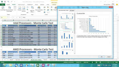
The program will show you some options that look good. Indeed, all of the chart previews now use your live data, making it much easier to get the chart you want. It’s not so much that you can do things you couldn’t before, but that it just works better. Another recommendation tool shows you suggested possibilities for pivot tables based on your data, taking a somewhat esoteric tool (that I use all the time) and making it easier for most people to get started. In addition, the pivot chart function (which creates charts from your pivot tables) is now much more obvious.
PowerPoint’s biggest change is probably a much improved Presenter View, including the ability to let the presenter zoom in on a particular part of a slide. Presenter can also choose a slide from a grid (that looks like the Slide Sorter view), but the audience will only see the things the presenter wants. It’s not a huge change, but it is more useful. It also now allows co-authoring via the Web app and direct links to online picture sharing services such as Flickr.
Outlook’s biggest change to the user interface is the removal of the calendar and task pane on the right side of the screen. It’s replaced by a way to peek at your calendar or tasks by just clicking on a big label in the lower left corner. Getting rid of the panel on the side makes a lot of sense on tablets, where space is at a premium. In normal use, though, I found I really missed the old calendar pane on the mail view, particularly on a desktop where I have the space. You can “pin the peek” and get almost back to where you started, but with only a single day’s appointment showing. I hope Microsoft rethinks this option before it ships.
On the positive side, you can now reply to a message within the preview panel, so you end up opening fewer windows, and that makes the program easier to manage. It also searches for messages within Outlook more quickly, and it’s supposed to be faster at synchronizing with Exchange as well. One minor but useful new feature is that it shows the local weather in the calendar view.
I haven’t been much of a OneNote user, but in some ways, it seems the most modern of the applications because you can use it on a Windows laptop and desktop and set it up to automatically sync with versions for Windows Phone, iPhone or iPad, or Android devices. It continues to be a good way to collect data from webpages and has added more table tools and better ways of embedding content. Note this is the only one of the applications that actually has a “Windows 8-style” (i.e., “modern” or “Metro-style”) app now available for download, known as OneNote MX.
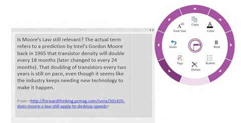
OneNote MX adds a new user interface, where the ribbon bar is instead replaced by a radial menu that puts all of the commands in a circle interface. I’m a bit surprised that it doesn’t yet support the Share menu that all the Windows 8-style apps have, which could be quite useful. Indeed, none of the Office apps seem to do that. So right now, I’m just not sure why you would use this instead of the desktop version.
Overall, the big changes are more about how the product will be licensed, how it is now more closely linked with SkyDrive, and how it works a bit better on tablets with the full-screen options and the touch mode. The other new features I’ve used—including improvements in the reading mode in Word, charting in Excel, and presenting in PowerPoint—are nice and will be useful, but aren’t really significant. While others have said this is a radical departure for the Office suite to me, it’s mostly the same one we have known, just modified a bit for the new connected, touch-based world.

Copyright © 2010 Ziff Davis Publishing Holdings Inc