Apple Liquid Glass design: Half full, half empty but too big to ignore

I’ve watched Apple refine its software facade for close to two decades now, from the skeuomorphic wooden bookshelves of iOS 6 to the flat, neon-tinted panels of iOS 7, from the frosted-glass translucency of Yosemite to the stark minimalism of Sonoma. Yet, even after all these iterations, I never quite expected Apple to pull the glass inside out.
And yet here we are… Liquid Glass, the design language Apple unveiled at WWDC 2025, feels like a bold – and utterly inevitable – next step in the never-ending quest to keep its ecosystem feeling coherent, alive, and just a little bit unpredictable.
What’s Apple Liquid Glass
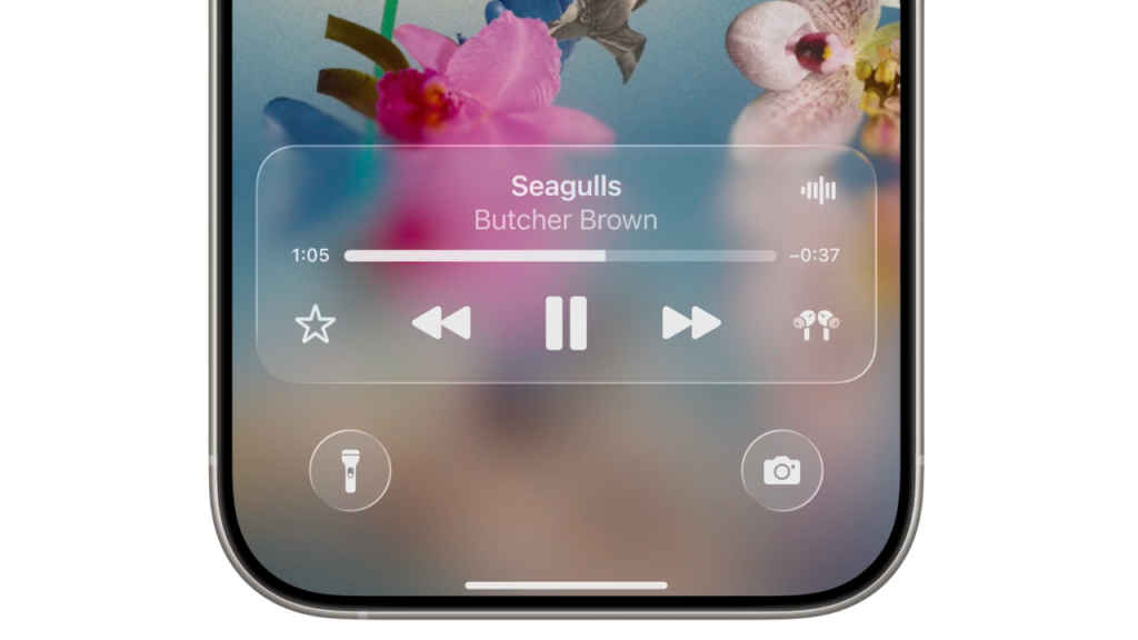
Liquid Glass isn’t merely frosted translucency on virtual steroids, as you saw on the keynote video, but an environment-aware, context-sensitive material engine that actively watches what’s happening on your screen – and around you. As Apple puts it, Liquid Glass reflects and refracts its surroundings, while dynamically transforming to help bring greater focus to content.
Also read: WWDC 2025: iOS 26 announced with new Liquid Glass design, AI features and more capabilities
Imagine a slider that subtly shifts hue when you flip into Dark Mode, or sidebars that catch flecks of your wallpaper’s gradient and swirl them into their blurred depths. This isn’t static blur – it’s real-time light-field rendering that factors in your chosen wallpaper, ambient brightness, and even the momentum of your scrolling thumb.
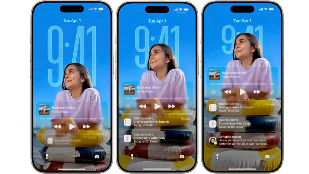
Under the hood, Apple’s new rendering engine calculates refraction and colour adaptation on the fly, enabling buttons, panels, and widgets to adopt a semi-reflective sheen that varies from device to device – and from moment to moment. On an iPhone 16 Pro, you might see a gentle sparkle along a slider track as you adjust volume. On a 16-inch MacBook Pro, your Finder sidebar could echo the pastel hues of your Mojave beach wallpaper.
Apple’s Human Interface Guidelines now spell out how developers can tap into SwiftUI, UIKit, and AppKit APIs to adopt Liquid Glass with a few lines of code – no performance penalty, thanks to dedicated hardware acceleration baked into every Apple Silicon chip.
Liquid Glass: Early reactions are a mixed bag
The design community’s response has been uniformly enthusiastic – on Twitter alone, I counted dozens of calls to make Liquid Glass the visual hallmark of the decade (maybe they are all Apple users?). I won’t be surprised if folks on Dribbble start mocking up Liquid Glass-infused versions of Slack, Notion, and even Android-style launches. Many people are lauding the buttery-smooth real-time blur effect of Liquid Glass, noting that Apple’s commitment to fluid animations again outpaces what even latest mobile GPUs can muster in Android devices.
Also read: At WWDC 2025, Apple puts design first again with iOS 26, macOS 26 Tahoe and iPadOS 26
On the other hand, accessibility advocates warn that overly translucent panels could muddy text contrast for users with low vision. Here I’d say the concerns are valid, since even I think Liquid Glass animations in their current form can create instances of sacrificing on readability, and no one wants that. Reddit threads mock the return of “Aero Glass,” complete with GIFs of Windows Vista-era mismatches – years before Microsoft figured out how to tame its own translucency. The Liquid Glass effect is also being described as “visually noisy,” especially for instances related to overlapping Liquid Glass layers in the Control Center, in particular.
Liquid Glass: A frivolous necessity?
I can’t think of another tech company other than Apple that could’ve pulled off something as lavish or frivolous as Liquid Glass. Deep down, it’s a luxury Apple can afford thanks to its silicon-centric vertical integration. From custom GPU cores to display pipelines, Apple simply owns every link in the hardware-software chain. And make no mistake, unifying all its platforms – iOS, iPadOS, macOS, watchOS, tvOS and more – under a coherent visual language was an inevitability. If you’ve ever toggled between your iPhone’s Control Center and your Mac’s Action Center and winced at the stylistic mismatch, you understand why. As Apple Silicon blurs the line between desktop and handheld performance, its UI needed a new visual glue. That’s what Liquid Glass is all about.
Of course, Liquid Glass isn’t perfect right now, and Apple has time to act on some of the readability concerns that are rightly being raised before they ship out Liquid Glass across all their OSes later this year.
Also read: Apple introduces iOS 26 and here is every new feature you will get
Love it or hate it, Liquid Glass also reminds us of how with Apple, art and interface are almost always inseparable. Even the most cynical among us can’t look at a beautifully refracted widget edge and not feel a fleeting spark of delight. As Boromir said of the One Ring, “It is a strange fate that we should suffer so much fear and doubt over so small a little thing.”
As a statement of design craftsmanship, Liquid Glass stands as another testament to Apple’s singular obsession of turning the mundane into the magical, even if it causes a stir for all the wrong reasons and appears to be frivolous at first. Because sooner or later, invariably it turns out to be a blueprint for the rest of the competition to follow.