Microsoft updates Socl with user-friendly features

Days after opening its social network Socl to everyone, Microsoft has updated the site’s UI based on the feedback of users.
 Survey
Socl had gone live in December 2011 as invite-only network built by Microsoft’s Research/ Fuse Labs, and opened up to a large audience in May. The site features elements of Facebook and Pinterest and is powered by Bing search engine.
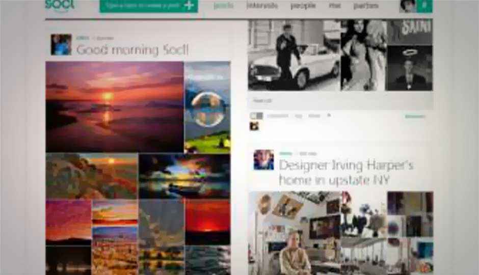
Announcing the update via a Fuse Labs blog post, the team said the entire experience on the site has sped up such as creating posts to see the Socl feed, which now appears in two or three column option, similar to Facebook Timeline. Users who haven’t signed in can now scroll the homepage of the network or simply browse by various topics.
Fuse Labs explains the update:
Posts. Viewing the rapid feed on Socl is faster and, well, just better. The home screen is all about the beautiful posts you create (often in just seconds, using the new post creator!). You can choose to see the posts two-columned or three, so it’s less likely you’ll miss out on anything. And now you can see the posts even if you are not signed in or are new to Socl.
Interests. The crowd-sourced interest gallery is more discoverable, helping you socialize with like-minded people over topics you care about.
People/Me. People finding and following can be done via posts, the new people gallery, or from a person’s page. Everyone on Socl has an updated page where profile information, posts, interests, people and parties can be viewed together in one place. Check out your “me page” today, or if you’re new to Socl, sign in and we’ll create a page for you.
Parties. Create a playlist and watch videos with others in Socl, and chat together as you watch.
Check out the updated Socl networking site here.
.jpg)