Facebook testing a new Timeline design: Reports

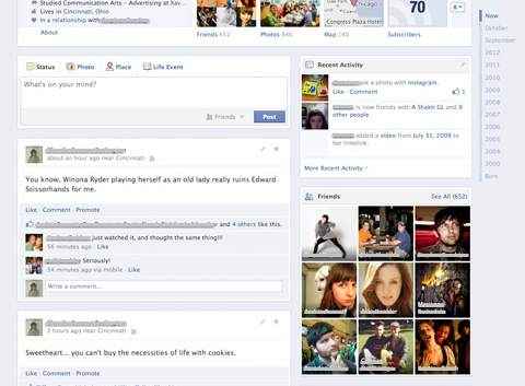
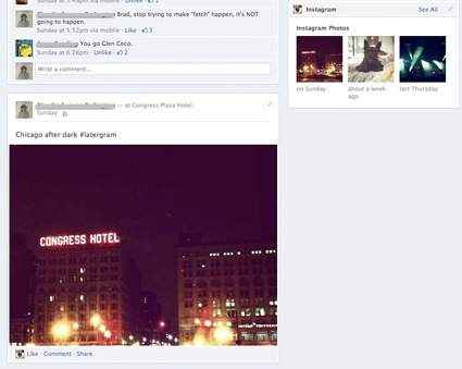
Facebook is currently testing a new format for Timeline, which will be putting all posts in a single column on the left, while the activity modules and friends, places, apps and other sections will be placed on the right.
 Survey
According to reports, the new Timeline layout will help Facebook address several complaints from users regarding the display of the posts in the new profile. Users have to look back and forth on the page while scrolling to check out their stream. The two-column layout makes it at times difficult to look for a specific posts.
The new design, however, does away with the line down the centre, making the Timeline less complicated. Timelines for dates still show in the top right of the page, which allows users to jump to a particular month or year.
The layout being tested shows the publisher and all posts beneath are now much wider. Modules such as “Recent Activity,” “Friends,” “Places” and those for any Open Graph apps are placed on the right, similar to what were on the original Timeline. The notable change in the design is that these modules don’t have the same size as posts. If there are no more modules to show, Timeline shows a blank space, instead of stuffing the space with status updates or wall posts.
The Next Web says Facebook has confirmed that this is the new design the company is testing for the Timeline. “This is a new design Facebook is testing with a small percentage of people to make navigating timeline even easier,” a Facebook spokesperson told TNW.
What do you think of the new version of Timeline Facebook is testing? Let us know in the comments section below:
Image courtesy: Inside Facebook
Also read,

