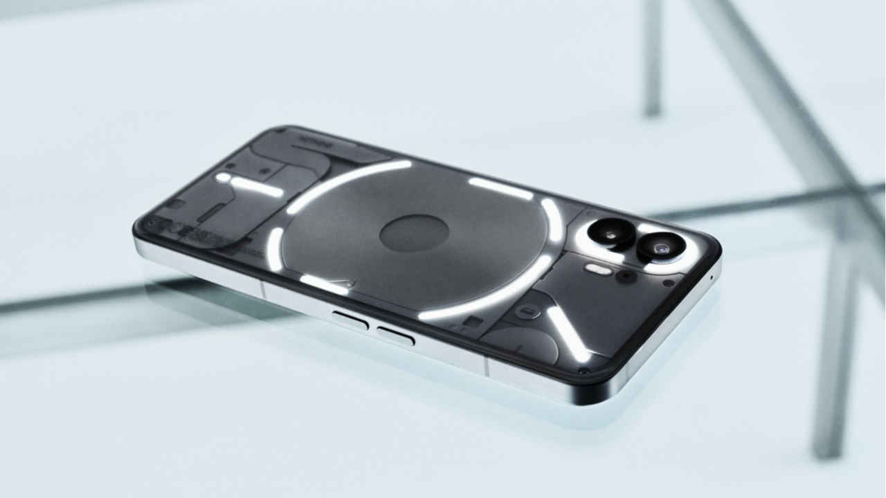
Nothing Phone 2’s design similarities to the Phone 1 is a good thing: Fight me
Nothing Phone 2 will remind you a lot about Phone 1.
The Glyph interface has some changes on Phone 2.
There are a few other differences between the two Nothing phones. But we argue that even the similarities are a good thing.

Nothing Phone 2 design has been revealed in an MKBHD Dope Tech video first. Then, now the company has also disclosed some press renders. Most of the online reaction to this has been a criticism of how similar it looks to its predecessor. But, I say, it’s a good thing.
 Survey
Let’s check the similarities I am talking about first and follow it up with why that’s a good decision by Nothing.
Nothing Phone 2 and Phone 1: Very similar yet different
Nothing Phone 2 ditches the black colour for a new Grey variant. This looks different enough to start discourse online. There is still the white edition.
The light patterns also see a change on the Phone 2. This is because of the way the LEDs are arranged on the new Glyph Interface. There are 3 times the LED zones as compared to the Phone 1’s setup.
Also Read: Nothing, just 5 Nothing Phone 2 details officially confirmed so far
The company also changes some of the use cases of this LED show:
The different LED zones can light up thematically to tell you the volume levels and timer status.
Even third-party apps like Zomato and Uber will show the delivery and cab status respectively through these LED strips.
One of the standalone LED strips on the top right corner can be mapped to one “Essential App” notification.
The back of the device also appears to be slightly rounded perhaps for better ergonomics.
Other than this, the two devices look very similar. They both have flat edges, a not-so-different Glyph setup, and a punch-hole display up front.
Nothing Phone 2: Why the similar design though?
With the Nothing Phone 1, the company which was new in the market introduced a design that shared some semblance to iPhone (the most popular smartphone in the market) but also had the whole Glyph interface screaming an unprecedented and bold look.
Nothing managed to imprint the Phone 1’s design in the minds of the masses. And when so many people know the predecessor’s design so well, it won’t be smart of Nothing to change the design of their new device.
Also Read: Nothing Phone 1 review
Even Apple adopts this strategy. In one of his interviews at the time of the iPhone 4s release, senior Apple designer Jony Ive said, "When you think about your iPhone, it’s probably the object that you use most in your life. It’s the product that you have with you all the time. With this unique relationship people have with their iPhone, we take changing it really seriously. We don’t to just want to make a new phone. We want to make a much better phone. iPhone 5 is the result of this approach."
Also, even with all the R&D effort it takes to bring a new design, they may not be able to reproduce the same level of excitement and recall value.
On the other hand, sticking to the same design ensures less cost for the company and it can allocate those costs and efforts towards other areas of smartphone development and promotion.
A new era. Where iconic design meets premium performance.
A product of meticulous engineering and obsessive attention to detail. Our proudest design story so far.
Come to the bright side. Meet Phone (2) on 11 July, 16:00 BST. pic.twitter.com/ckgmAXCawi
— Nothing (@nothing) July 4, 2023
G.S. Vasan is the chief copy editor at Digit, where he leads coverage of TVs and audio. His work spans reviews, news, features, and maintaining key content pages. Before joining Digit, he worked with publications like Smartprix and 91mobiles, bringing over six years of experience in tech journalism. His articles reflect both his expertise and passion for technology. View Full Profile