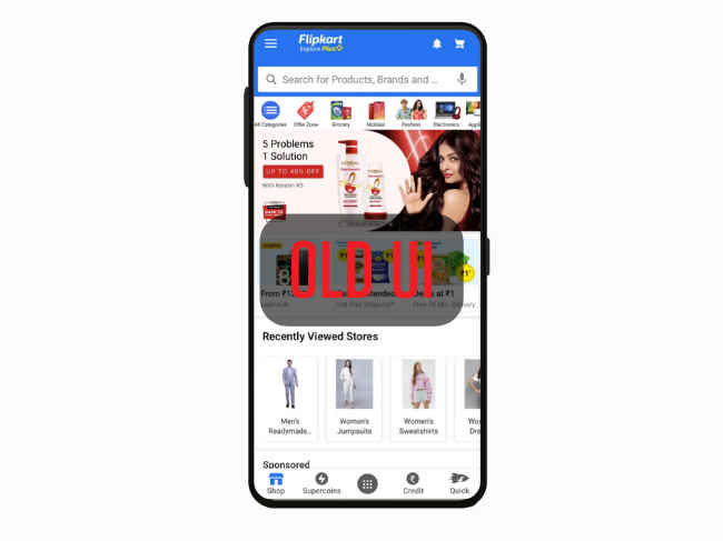
Flipkart App On Android Phones Gets A New Design Tweak: Here’s What’s Changed For Users
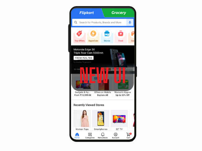
The new Flipkart app has a revamped navigation.
There is a dedicated Grocery tab in this Flipkart UI.
Flipkart also adds new fonts, icons, category pages, and better incorporation of vernacular language.

Flipkart for Android is gaining a new design treatment to improve the user experience, especially for new-to-internet customers. The main emphasis is on making navigation seamless across different categories of products and services. The Grocery business of the platform also gets its due attention in form of a dedicated tab on top of the homepage. Flipkart grocery has apparently extended its reach to 1,800 cities in India.
Here’s all that’s new on the Flipkart Mobile app:
New Flipkart UI Changes and Features
The new navigation system has been reworked with simple, common, and logical patterns. In the media release, Flipkart says with this UI, everything from switching between shopping from the homepage, browsing various product categories, adding to the cart, then checkout, and checking notifications and details for past orders is possible right from the bottom navigation bar.
These improvements are made with respect to “uniformity, predictability, ease of use and … a people-first app design”. The eCommerce brand reveals that it had around 6 variations of the navigation design put through A/B testing with thousands of users over a period of 2 months. The new navigation structure had more than 5x engagement against the previous version. Based on this research and its results, the current UI was selected.
More such UI changes like in the case of fonts, icons, category pages, vernacular language interfaces, etc will be introduced in phases. These will be rolled out to all major platforms on mobile and web.
The other major change is how Flipkart Grocery shopping takes front and center. It is now a separate and more visible tab on the homepage itself.
This new Grocery tab will be rolled out to users in the 10,000 pin codes across 1,800 cities, wherein the Flipkart Grocery service will be live.
Apart from these, there are some miscellaneous design changes such as:
- A “discovery” menu below the search bar with features like SuperCoins, Stores, Flipkart Feeds, Offer Zone, etc.
- There is no hamburger menu or the top bar. Only the bottom bar is present and that too is restructured with icons for ‘Home’, ‘Notifications’, and ‘Cart’.
- You will find My Orders now within My Account in the bottom navigation bar.
Commenting on the design revamp, Bharath Ram, Vice-President, User Activation and Retention at Flipkart, said, “User experience and design is a crucial part of providing a holistic e-commerce experience for existing and new-to-internet customers, and we, at Flipkart, are committed to building a simple and intuitive experience for them. A multidisciplinary team of designers, researchers, product managers, and engineers worked together to build the new design, which offers a refreshed user experience of our mobile app with a simplified navigation framework and a host of other design enhancements to enable easy discoverability of categories and seamless navigation across the platform, thereby simplifying customers’ e-commerce journey. The introduction of the Grocery tab on the homepage is one such design upgrade which will allow customers fast access to a category that is very important in everyone’s lives and is in line with the fast expansion of Flipkart’s grocery presence across the country.”
As for other news, reviews, feature stories, buying guides, and everything else tech-related, keep reading Digit.in.