What makes a good smartphone UI?
There are a number of UIs that are available today. Sony, HTC, Samsung, Xiaomi etc. all provide their own user interfaces. But what does a good UI actually need?
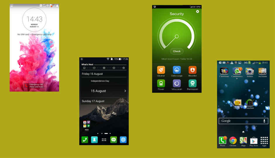
Smartphones today are as much about the user interface as they are about their spec sheets. We often talk about the UI elements of a phone, about what’s good, what’s not and so on. But what exactly makes a good UI? Well, personal choice matters, but there are some things that make a UI stand out. Let’s take a look.
 Survey
– Simplicity
– Features
– Customisability
– Device Compatibility
– Memory usage
Simplicity and ease of use
To say that the user base for Android phones is varied, would be a massive understatement. Look around you and you will be able to spot at least ten different kinds of users. While some are willing to take the time to learn a UI, most want their UI to be simple. They want the UI to be easy to learn and get used to. At the same time, the UI should look good and offer useful features.
The best example of this is perhaps the LG Optimus UI, which fits the above mentioned requirements. The home screen on this UI doesn’t have a lot going on, but the icons are bright and colourful, making your screen look good. There is also something called Smart Tips, which gives you handy tips about your phone. When you go into your app drawer, it is mostly stock Android, with nothing new to learn.
Perhaps the major change is in the multi-tasking screen on the Optimus UI. You’re presented with small card like views for the apps that are running and you can swipe things out of the screen to close them. You can swipe up or to the left or right to close them. The multi-tasking screen may look a little intimidating for very basic users, but you will quickly realise that LG has only changed the look, keeping the way you close the app almost the same as stock Android.

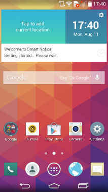
Optimus UI Lock Screen, Home Screen and App Drawer from LG.
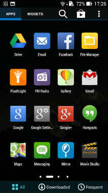
Another example of a simple and easy to learn UI is the Zen UI from Asus. The Zen UI brings most of its changes in terms of the look. Whether it looks good or not will depend on personal tastes, but it looks different and gives a different personality to your phone. Asus has also added apps like What’s Next and Do It Later, to give you some handy task scheduling features.
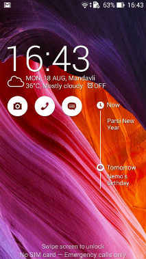
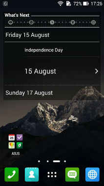
Zen UI Lock Screen, Home Screen and App Drawer from Asus
Both these UIs are sufficiently simple, but the Optimus UI tops Asus in terms of looks and feel. LG has done a better job with the look and feel of the UI. It looks more elegant and feels better when you’re using it. The notification bar on the Optimus UI is transparent, which doesn’t have any functionality, but adds to the overall aesthetics. It makes it a little more premium, as do the card like app windows on the task manager.
Both these UIs though offer very simple and easy to learn interfaces. You won’t have to spend hours to figure out what is where. There is not much jargon that will confuse you and things are simple yet different.
Perhaps the simplest UI you can find is the Xperia UI that Sony provides. But does that make it the best? The answer is no and the next point will answer why.
Features and functionality
While companies use UIs today to differentiate their products, the actual use of a UI is to give the user easy elements to work with. The UI doesn’t only make it simple or difficult to use an OS, it also adds and removes features from it, or in some cases even amplifies them. The best example of this is perhaps the MiUI that we have talked about before. Xiaomi gives you an overload of features with this UI, some functional and some gimmicky.
Certain elements of the MiUI, like private messaging, lock apps on task manager, toggle music keys on lock screen are very useful. Perhaps the best and most useful thing about this UI though is how you move apps in it. You can long press and app and then move the screen, instead of dragging an app to the corner of the screen. It’s easy and very useful. The MiUI has other features too, which give it a completely different persona than any other Android UI available.


MiUI from Xiaomi
Another example is the Sense UI from HTC. HTC users often swear by how useful they have found Blinkfeed to be. It brings all your social networks, news etc. in one place and lets you browse through them quickly. The same is done by the Flipboard app that Samsung provides.
The downside to these UIs though is that they have a steep learning curve, especially the MiUI. Users often shun Apple’s iOS for the lack of an app drawer, which is the same in the MiUI. Now if you come from a non-Android background (Symbian, Windows) then you’re in for a surprise and one that may not be pleasant for you. Similarly, while HTC retains the app drawer in Sense UI, you have to slide up and down for various pages. That again takes some getting used to. Stock Android, Samsung’s Touchwiz etc. all have a left/right swipe for various pages in the app drawer, meaning you’ll eventually remember what app is where. This is not so in Sense, giving it a steeper learning curve for an inexperienced user.
The Xperia UI mentioned above lacks features, that is, things that can add to the user’s overall experience. The only thing that Sony provides in the Xperia UI is an excellent camera app, which is hardly enough. This is where things like the MiUI excel, in giving the user tons of features that they will get addicted and used to.
Device compatibility
The UI that a company gives you is also something that it will use on all of its devices. It may make minor tweaks to it, but the backbone will remain the same. The UI differentiates one company from the other and has a big hand in building its community. Users often stick to the same company because they won’t have to learn and get used to an entirely new UI. But that can’t be achieved unless your UI is more or less the same in all your devices.


Samsung Touchwiz on a Galaxy Grand 2
The Samsung Touchwiz UI excels in this department. Pick up any Galaxy smartphone and you see many similar elements in terms of the UI. Yes, there’s definitely a difference between the Galaxy S5 and Galaxy Y for example, but they are still very much the same. Some find this a little troubling, but the fact is that your UI should be made to work on various smartphones. Touchwiz is definitely not the best UI that you can find, but it does this job successfully, unlike the Sense UI from HTC.
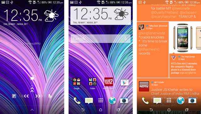
Sense UI on HTC One (M8)
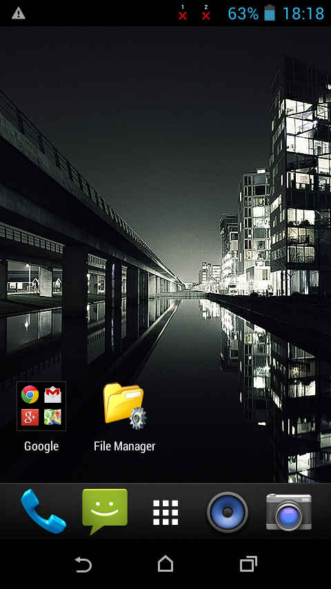
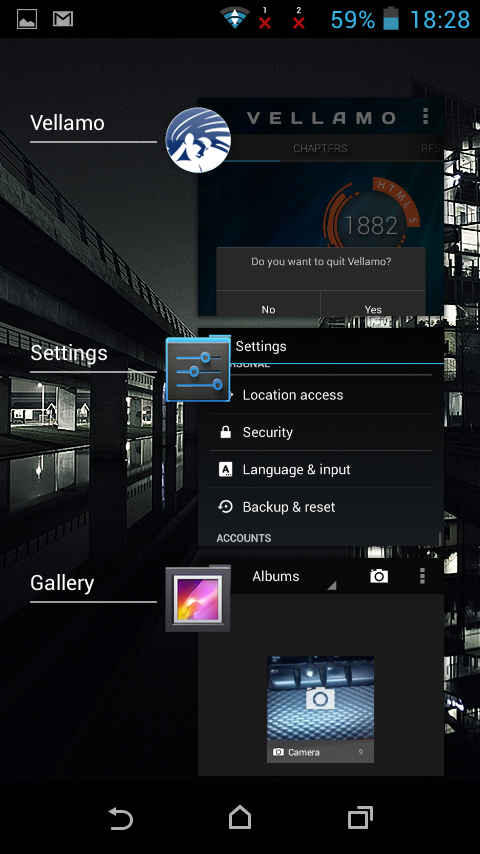
Sense UI on HTC Desire 310
A UI that doesn’t fit this criterion is the Sense UI. HTC uses a toned down version of Sense in its Desire 310, 210 and other inexpensive smartphones. The full UI is available on its One series of smartphones, which tells you that the company itself knows that the UI doesn’t suit these devices. Why? That comes below.
Memory usage
In order to ensure that a UI works on various devices, it must be memory efficient. HTC uses a toned down version on the Desire 310 because it is not as powerful as the One series of smartphones. The MiUI also uses a lot of your system’s RAM. On the 2 GB Xiaomi Mi3 smartphone, you will never have over 1 GB free, because it is being used by the UI. The least system resources is of course taken by the stock Android UI, but that lacks a lot of features that others provide. So, Motorola provides better performance in its Moto G, Moto E and Moto X, partly because of the stock Android ROM in them.
Customisability
No one likes being confined to one look and one thing. Customisability is an important feature of a UI. The MiUI does this through its themes and so do some others. The reason Xiaomi excels in this department though is because it allows a lot of leeway for developers and users. Each theme in the MiUI brings a completely new look, because developers can change even the smallest elements like how the icons look. The user on the other hand can download a theme that makes his phone looks different all the time.
Conclusion
Frankly, there is no UI that fits all the criteria mentioned above right now, which means the choice will depend on the user. A good UI is that which lets you use your phone exactly the way you want to. It should provide you with less gimmicks and more useful features and at the same time be less resource intensive.
A UI today is used to give each smartphone maker their own look, but it should be something that gives the user more power. What is important is a balance between the above elements with some gimmicks here and there. Gimmicks do add a certain show off element to a smartphone that is dear to many users.
The UI should accentuate a phone’s primary features, while giving the smaller features more power. It should also strive to make up for the shortcomings of the OS and provide some additions of its own.
Trying to explain technology to my parents. Failing miserably. View Full Profile


.jpg)
