How iOS ruins an otherwise great device
And other observations from when I popped my Apple Cherry.

As unbelievable as it may sound, I haven’t spent a significant amount of time on an iPhone, ever. Yes, until recently I was an iVirgin. Sure, I’ve dipped my err stick in the Apple ecosystem a few times before – an iMac for a while in 2012, and one of the very first iPads as my only computing device on a rather long offsite assignment back in 2013 – but never the iPhone specifically. My interaction with every new iteration of the homogeneous device was limited to the few minutes of “ohh so this is what the gold iPhone 5 looks like?” followed by the usual “Meh”.
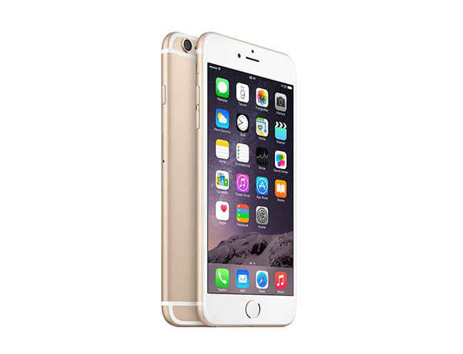
Over the last couple of months however, I’ve had the pleasure of using the 128GB iPhone 6S Plus. Having used it as my primary mobile communications device, I’ve had the chance to come to some really solid conclusions not only from the tech standpoint, but also from the socio-cultural perspective. As you might imagine carrying around a Rs. 92,000 phone has peculiar effects on how you are perceived by people. I’ll keep those bits reserved for another rant but for now I’d like to focus on the technology aspect.
So what’s my verdict about the phone? It’s an absolutely brilliant device with an utterly ridiculous, almost castrated UI. Most people who come to this conclusion make the mistake of saying it’s the operating system that is bad. This is not necessarily accurate because iOS, for whatever its interface handicaps may be, plays quite well with the underlying hardware; as is evident from its battery life and smooth operation. It’s the uppermost layer that I have a problem with.
What’s so wrong with iOS on the usability front? Where do I begin!
Apple seems to have a dogged desire to keep things simple. That’s not such a bad goal to aspire to, but when your penchant for simplicity crosses over into downright dumbing down of things, it’s something to worry about. Take the home button for instance. I’m sorry but making me go tick-tick on it twice to bring up multitasking just seems moronic.
This brings me to another issue – what’s with not having a back button? People defending this design philosophy will say that apps are coded to have their own contextual back buttons. Yes they do. But hardly ever in the same place! Sometimes a close button appears at the top left (for eg while playing a video in the Facebook app) and sometimes a “Done” appears on the top right. Why should these buttons be placed at the top? iPhones certainly aren’t getting any smaller (oh wait they are!). If sometime in the future Apple decides to have a back “feature” I’m pretty sure they’re going to find a convoluted way of implementing it, all in an effort to adamantly stick to their precious solitary home button. Who knows, maybe they’ll make you go tick tick tick thrice on the damn thing.
An otherwise brilliant device
I think the reason Apple comes up with these absurd workarounds is because they have a tendency of making proclamations that’ll come back to bite them later. Remember how Apple stubbornly refused to have a two button mouse for the longest time? Tell me, is “control clicking” to bring up contextual menus seriously more intuitive than having a right click right there on one single input device? The home button seems to be one of those things where they’ve dug their heels deep.
Now some of you may say that these are minor gripes. But are they really? I had this long discussion with a couple of guys recently on the same topic. These are people who have been entrenched into the Apple ecosystem for a long time. Their entire argument hinged on being “used to” something. Apple’s way of defining hierarchy in iOS for example, is like a system of layered cards they informed me. So you could swipe in from the left and dismiss those stacks of cards and in effect go back steps. Yes but with this system you cannot retrace your steps backwards precisely. [Edit: Say for example you followed a browser link from WhatsApp, you won't be able to swipe from left to go back to WhatsApp]. These hardcore Apple guys then went on to ask me how my way is better? What is to say one system is better, it ultimately boils down to what you are used to… Well first of all it’s not my way. I’m not a stakeholder in Android or any operating system for that matter. I just think that UI decisions should be guided by logic and maybe quantifiable parameters such as number of steps to accomplish a task for example. If “being used to something” is the only argument then all I can say is I can get used to walking around with stones tied to my feet all day. But it’s not the most efficient way of getting around is it? Let me give you another example: the QWERTY layout was designed to overcome mechanical constraints of typewriters (jamming) and wasn’t necessarily the layout that could enable the fastest typing speeds. When we shifted to electronic keyboards the layout could have undergone a rethink, but it didn’t. If tomorrow research conclusively proves that an alternate keyboard layout such as Dvorak is far superior, I wouldn’t shun the thought. Just because I’m used to QWERTY doesn’t mean Dvorak isn’t superior. Would I go into my system settings and change to Dvorak? Probably not because it would render me handicapped on 99.9999% of the world’s PCs.
iOS for all its firsts seems to be plagued with similar problems. And it’s not just me. Other people have also started noticing how iOS seems to be stuck in a bygone era.
To be fair though, iOS is indeed trying out some new things. For example, back in October 2015, I wrote in a column that “this 3D Touch business seems really promising”. A whole new way of interacting with your device couldn’t possibly be a bad idea. But back then there weren’t enough apps that could showcase those interesting possibilities. I’m still waiting…
Since the time I’ve been using the phone I’ve been quite vocal about reporting my experiences on social media. On one such post, I had a fanboy come up and declare “the only people who hate Apple are those who hate simplicity and reliability.” Well, butter knives are simple and reliable. But if someone were to give me a Victorinox and it just happens to have a butter knife as one of its pull out blades, I wouldn’t complain. That’s exactly what Android feels like to me – an OS that delivers your basics along with complex tools for those who want them.
On the reliability bit too I have something else to report: you know that thing they say about how Apple products “just work”. Well they do… except when they don’t. On the very first run the iPhone gave me trouble by going into this get-install loop while downloading apps – a known issue apparently. How’d I fix it? A restart of course! Not very different from the “when all else fails, restart” model we follow for other tech products right?
And finally, don’t even get me started on that mess of an application they call iTunes (at least on Windows). The whole process of transferring music onto the phone is so daunting, I’ve been procrastinating more than my usual share. But I’ll leave that for another rant for it’s now time to wind up.
The phone does have a few things going for it though. The hardware obviously (brilliant camera for instance), but on the software front too I like that the apps are better built. Perhaps the result of stricter quality standards imposed by the App Store.
Either ways, there you have it – a blow by blow account of an iVirgin’s deflowering. You know where to send your hate mail. But remember to be gentle, it’s my first time 🙂