Exploring layouts for the Picasa Gallery app using Flash Builder 4
 Follow Us
In our last tutorial we created an application using the Flex SDK in Flash Builder 4 for browsing an image gallery exported from Picasa. In this tutorial we will continue from there and add some features to our previous application to make it better.
 Survey
In this tutorial we will explore the concept of layouts in Flex 4, and how we can take advantage of them.
What are Flex “spark” layouts?
In a Flex application, we usually have multiple components which are arranged in some layout in our applications. They may be horizontally laid out, or vertically, or in a combination of horizontal and vertical layouts, with groups of vertically laid out elements interspersed between horizontally laid out elements. This is accomplished by having different containers which have different layouts, and by placing one container within another very complicated layouts can be accomplished.
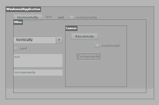
In the earlier version of the Flex SDK (v3 with the “halo” component set), one could use containers such as VBox for vertical layouts, and HBox for horizontal layouts etc. These both derived from the Box component. Flex 3 also supported a Canvas component which used absolute positioning, where instead of laying out components according to a particular layout, each component would be given a fixed position.
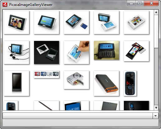
In the new component architecture called “spark” which has been adopted in Flex 4, the layout mechanism of containers is kept separate. So while the Group container, TitleWindow container, List container all have different features, and looks they can be assigned any layout we want, and the way they place components will be derived from that. So while the Group and Panel components are simply for displaying components, and the List component is for displaying and navigating through data, they can use the same layout. In our last example we used a TileLayout with a List to display our gallery.
You can write your own layout mechanisms if you want to control how components are placed. You could for example take a list and create a iTunes-like coverflow, or a 3D carousel etc.
Let us take our list of images from the last tutorial:
<s:List id="imagesList" dataProvider="{index}" width="100%" height="100%" click="imagesList_clickHandler(event)" > <s:layout> <s:TileLayout /> </s:layout> <s:itemRenderer> <fx:Component> <mx:Image source="{data.itemThumbnailImage}" /> </fx:Component> </s:itemRenderer></s:List>
Here within “layout” property we have added the TileLayout component which manages the layout for the objects in our List. The TileLayout component manages the arrangement of the images we load from the Picasa gallery. We can very easily swap this out and put in <s:VerticalLayout /> instead which will lay out items in a vertical orientation. We can configure out layouts as well, the TileLayout class for example allows for configuring the horizontal and vertical gaps and alignments, the number of columns or rows, we can choose a row or column oriented layout and more.
Another interesting concept is that of virtual layouts. With a virtual layout you can have a list display hundreds or even thousands of elements, and Flash Player will render only as many items as required. This will allow you to display a very large amount of data in Flex containers.
Due to this flexible architecture, it is not only possibly for you to experiment with different layouts by changing just a single tag in your code, but you can also change the layout of containers in your project at runtime!
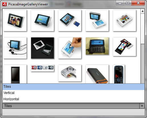
That is what we will do in this tutorial, we will add a drop-down list to our previous project which allows us to pick form a list of different layouts.
The tutorial continues on the next page.
You can download a free trial of Adobe Flash Builder 4 from the Adobe website.
Extending our Picasa Gallery app
With the power you have from simple MXML tag-based code you won’t even need to add any ActionScript for this basic functionality!
What we will do is to add a drop-down list to the UI which will list all the available layouts and on changing the selection in that list, the layout of our images will change.
This entail the following things:
- We need to add a DropDownList component to our application
- We need to create an array of layouts to display in the DropDownList
- We need to associate each entry in the DropDownList with a layout object
- We need change the layout with the selection
STEP 1: Add a DropDownList component to our application
This is simple, we just add the following after the list code in our previous application:
<s:DropDownList> </s:DropDownList>
If you just add this and run the application, you will see the drop down list we have added will overlay the list we added earlier. Quite conveniently, this is a layout issue! Since we have not specified a layout for our application, it defaults to using BasicLayout. BasicLayout uses absolute positioning and layout, where you need to specify the position and size of every component added to the application.
This is quickly and simply remedied by adding a VerticalLayout component as the layout for the applications. We can do this by adding the following code inside the application tag:
<s:layout> <s:VerticalLayout /></s:layout>
Let’s make the width of this drop-down list 100% and give it an id so we can refer to it later. We are left with the following code:
<s:DropDownList id="layoutSelector" width="100%" ></s:DropDownList>
STEP 2: Create an array of layouts to display in the DropDownList, AND associate each entry in the DropDownList with a layout object
To display the layouts in a list we need to have a name for the layout to display in the list, and a instance of that layout object. For this we will create an array of Object instances, with each having two properties, a name to display in the list, and a layout which has a layout object instance.
Here is a sample object:
<fx:Object name="Tiles"> <fx:layout> <s:TileLayout /> </fx:layout></fx:Object>
The Object class is the base of everything in Flex; it is a dynamic class, so you can attach properties – such as ‘name’ and ‘layout’ – to it at runtime. We will create an array with multiple of these objects and add it as the data source for our list.
Let us add VerticalLayout and HorizontalLayout. Note that you can configure the objects in these instances as you like. Here is the finished code of an ArrayCollection with these three layouts:
<s:ArrayCollection id="layouts"> <fx:Object name="Tiles"> <fx:layout> <s:TileLayout /> </fx:layout> </fx:Object> <fx:Object name="Vertical"> <fx:layout> <s:VerticalLayout gap="5" /> </fx:layout> </fx:Object> <fx:Object name="Horizontal"> <fx:layout> <s:HorizontalLayout gap="4" /> </fx:layout> </fx:Object></s:ArrayCollection>
Note that this needs to be added inside the <fx:Declarations> tag in your applications code as it is not a visual component. We have given it an id of “layouts” so that it can be used as a source for the DropDownList.
The tutorial continues on the next page.
STEP 3: Add the array of layouts as data source for the DropDownList
To add this as a data source for our list, we just need to bind it to the dataProvider property. We could have also chosen to place this entire list inside the <s:DropDownList> tag, which would have had the same effect.
To have it pick up the names from the objects and display them in the list, we use the labelField property. This property can be used to tell the List component which property of the list items is to be displayed in as a label.
We will also initialize it with a selectedIndex of “0” so that the first layout comes selected by default. Here is the final code:
<s:DropDownList id="layoutSelector" labelField="name" width="100%" selectedIndex="0" dataProvider="{layouts}">
If you run the application right now, it will be display the drop-down list with the listed names, however changing it will have no effect. That we save for the final step.
STEP 4: Change the layout with the selection
This step is quite easy. First we remove the layout we have set to prepare to have it set dynamically.
Next all we need to do is bind the layout of the List to the “layout” property of the currently selected object in the DropDownList. So in the end we need to add the following inside the <s:List> tag:
layout="{layoutSelector.selectedItem.layout}"
However just to be safe will we have the layout default to the “TileLayout” in case no item is selected. The final code for that is:
<s:List id="imagesList" dataProvider="{index}" width="100%" height="100%" layout="{ layoutSelector.selectedItem ? layoutSelector.selectedItem.layout : new TileLayout()}" > <s:itemRenderer> <fx:Component> <mx:Image source="{data.itemThumbnailImage}" /> </fx:Component> </s:itemRenderer> </s:List>
You may notice that the layout attribute now reads:
layout="{ layoutSelector.selectedItem ? layoutSelector.selectedItem.layout : new TileLayout()}"
This is a check to ensure that we always have a valid layout. So if no item is selected (layoutSelector.selectedItem does not have a value), the layout for the List will be a “new TileLayout()” object, while in other cases it will be the “layout” property of “layoutSelector.selectedItem”
That’s it! Run the application and you will see that the application will change layouts as you change the selection.
 |
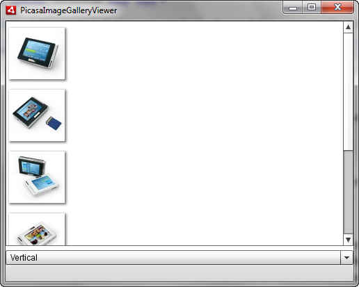 |
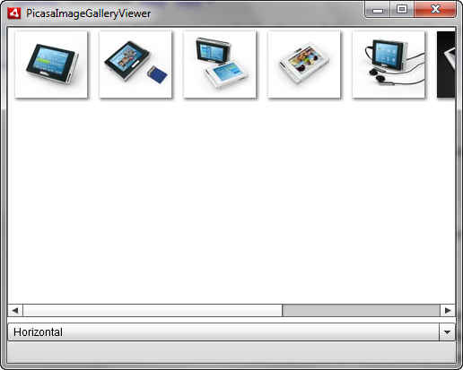
| We can now choose a horizontal or vertical layout besides the default tiled layout | |
The tutorial continues on the next page.
You can download a free trial of Adobe Flash Builder 4 from the Adobe website.
How about we use some custom layouts not available with the Flex SDK by default?
The Flex 4 architecture allows us to write custom classes which define how components should be laid out. How to create custom layouts is beyond the scope of this article; we will just use one of the freely available classes from project other people have created.
Let us start with a layout called FlowLayout. This layout is explained in a project included with a tutorial on layouts at the Adobe Devnet site. We have modified the code very slightly so you should download our copy from here. The “flow” layout looks and is quite similar to the tile layout we have already used with out project, and the one we used in the previous article. How it differs is that while the Tile layout arranges you items in a grid with a fixed number of rows and columns, the flow layout simply places each object one after another in a row, like words in a sentence. This allows for a more compact layout which shows as many items as possible in the screen area. If all the items are of the same size though, then the flow layout wont be as useful.
Download the zipped FlowLayout.as file from our site and extract it in a directory (or package) called “layouts” inside your project’s “src” folder. Now just as you added all the other layouts in the “layouts” ArrayCollection, add the FlowLayout:
<fx:Object name="Flow"> <fx:layout> <layouts:FlowLayout /> </fx:layout></fx:Object>
After this is done, run the app, and you will see Flow as an option for layouts. It’s that simple!
If you know any open source project which uses a layout that you like, it is usually this simple to integrate it into your project – you need to comply with their license of course.
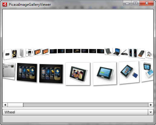
Let us now look at a 3D layout. Download the zipped WheelLayout.as file (originally from http://evtimmy.com/2009/06/wheellayout-source-and-quick-mashup/ ) and add it to your project like you did for the FlowLayout (copy it to the package called “layouts” in your project).
Once again, add an object for the Wheel layout to your array:
<fx:Object name="Wheel" > <fx:layout> <layouts:WheelLayout /> </fx:layout></fx:Object>
Now run the project, and select the wheel layout, and here is what you will see:
Flex make it quite simple to use complicated layouts with your data, and there is an abundance of open source projects, components and libraries which you can use with your projects.
You can download a free trial of Adobe Flash Builder 4 from the Adobe website.