Google Material Theme redesign detailed in new video as Google Support page implements new design
Google has pressed the launch button for the Material design changes it announced at Google I/O 2018 and almost all Google apps and services will be refreshed with the new design.

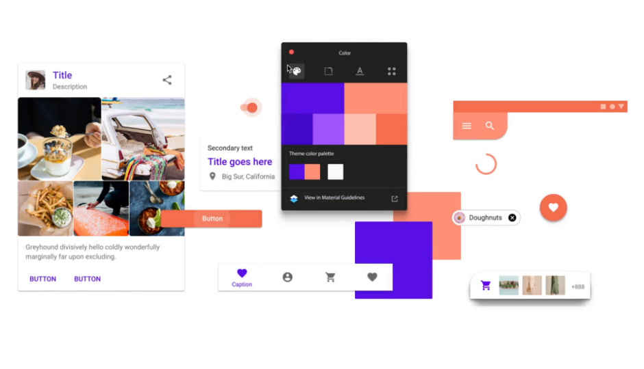
At I/O 2018, Google announced a new design system called Material Theming for app developers. As a part of it, Google itself is implementing the new design in all its apps and services. The update to the apps will roll out in phases, but before that, a video that surfaced on Vimeo spilled some of the beans. Some of the new design elements can be seen on the new Gmail, Chrome and Google Map refreshes, but that’s just the beginning.
 Survey
The video made by designers Adam Grabowski and Niccolo Bianchino has since been taken down, but not before Twitter users reuploaded it. The video shows a lot of things very quickly, including changes in the font and icons as well as how colours are going to be implemented.
Google’s iconic floating action button has been moved from the bottom right to the center in the bottom bar. The colours of the Google logo (red, yellow, green and blue) will feature more frequently in app UI designs. Graphs and clocks will have a rounded edges and sport Google colours. The new Google Sans typeface will replace the current Product Sans and Roboto fonts across all Google apps and services, including the company’s logo. The new Google Sans is a leaner and cleaner version of the older fonts that goes well with the new changes.
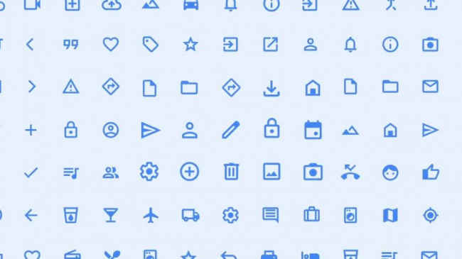
The icons are also made leaner. They are now more hollowed out and looks lighter with less visual weight. The apps themselves have more generous use of white. The coloured top bars in apps are gone. While that might not be good for OLED displays, it could be an indication that a dark theme is coming since coloured bars are more difficult to invert while changing to dark mode.
Moreover, the blinking cursor also flashes in Google colours instead of just blue. We also see a quick glimpse of the newly designed apps. Weirdly though, some apps still have the floating action button on the bottom right instead of being on the center. The apps also feature the bottom bar more prominently and house the hamburger menu and search button. The UI also gets a more card-based refresh.
The new design might go live with the launch of Android P with more apps and services due to get a new paintjob. The redesign elements have gone live in the website for Google Support. Among the apps and services that are poised to get the new update are Google News, Google Play Games, Google Pay, Wear OS, Google Assistant, Google Maps, Gmail, Google Drive and more.
Google Material Design pic.twitter.com/10Od0oUmgX
— RΛMIN NΛSIBOV (@RaminNasibov) July 24, 2018
Digit NewsDesk
Digit News Desk writes news stories across a range of topics. Getting you news updates on the latest in the world of tech. View Full Profile
