Google simplifies the YouTube video page; Puts focus on video where it belongs

Like nearly all Google products, YouTube is not without its share of flaws. When serving a community as large as the one around YouTube, odds are you end up with a range of features which only serve a few, and blot up the experience for the rest.
 Survey
Take a look at the YouTube video page, it is filled to the brim with features, yet the ones you use the most are often obscured away. In an effort to simplify and refine YouTube, Google has now unveiled a new video page, with ideas based on user suggestions and surveys.
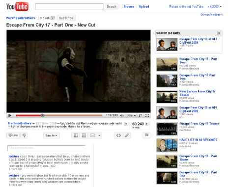
The new page rightfully puts the focus of the page on the video itself, which of course is what most people are there for in the first place. The new page has as few elements as possible, and the rest is cleverly hidden away till you ask for it. This makes for a much cleaner page with fewer distractions.
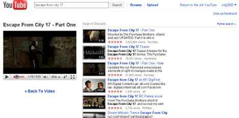
The new layout is simple, the video is the left column, as always, and a playlist appears on the right which showcases videos based on how you got to the video in question in the first place. For example, if you search for a particular video, you will get the list of relevant search results. Searching for videos will no longer disrupt your video viewing experience as the video will just shrink while letting you view the search results in an expanded right column.
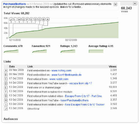
Interestingly since the powerful features are just hidden away and not removed, they are easily accessible if you click to expand the relevant sections on the page. For example, expanding the views section, which normally only lists the number of views, will give you a detailed graph of views, comments, ratings etc.
Ratings have been removed and a simpler like / dislike model has been adopted, as in Google’s experience people mostly only give 5-star and 1-star ratings. “Liking” a video will also add it to your favorites. Quite understandably this is something which has quite a few people irritated, as viewers are more likely to rate a video with 5-stars than to add it to their favorites. Hopefully this is something which will be left to the user when the design is finalized.
The Like button along with all other actions that are possible for a video are now added to a single clean bar below the video. This bar gives you access to the Like and thumbs down button — kind of strange and inconsistent Like / Thumbs Down? really YouTube! — and other actions such as sharing the video on social networks, getting the link and embed code, and flagging the video.
Another one of the changes is in the Video player which seems to have been here for a little while. The new video player now offers quality controls in the video player itself, and offers a new expand button which expands the video to fill the page width.
Right now the new video page is available as an opt-in for those who want to test out the new page, and suggestions made right now might still be factored in before it gets rolled out for the general public. You can opt-in by following this link, and an opt-out option will be available near the top right of the page if you so want.
YouTube seems to be on quite the upgrade spree, as just yesterday they added an experiment which would allow one to use the new HTML5 video tag instead of Flash for playing videos. And Recently they have also unveiled videos for rent on YouTube. 2010 looks like a good year for YouTube indeed.


