Top 5 Android P Features: Adaptive Battery, Redesigned UI, gesture based navigation and more
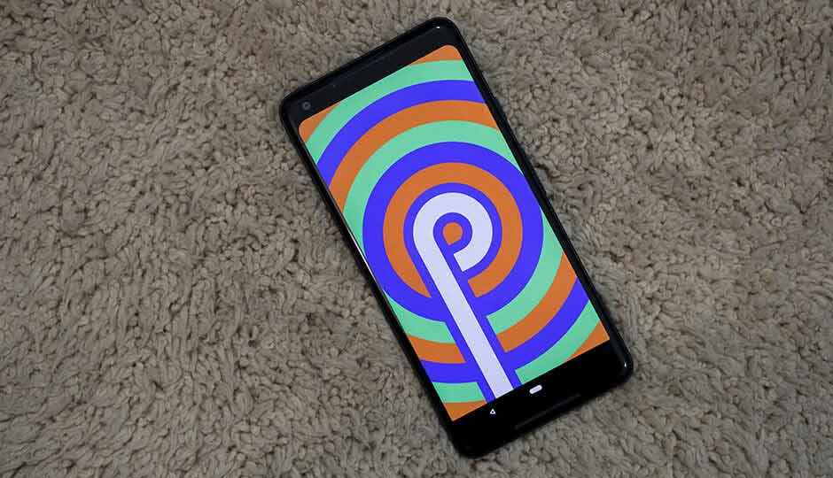
Android P Public Beta has been out for less than a day, but with compatibility for more than just Google's own devices, more people are likely to get on-board as early adopters
Google’s I/O 2018 was jam-packed full of interesting announcements, but the one we had all been waiting for eagerly was for Android P. Dave Burke, Vice President Engineering (Android) at Google showed off a whole set of features that will be a default part of Android P. This is over and above the incredible new functionality that Maps, Google Assistant and Google Photos will be getting over the next few weeks and month. We downloaded the Android P public beta on our Google Pixel 2 XL the minute it went live, so that we could bring you a better look at what the new OS has to offer. While there are numerous changes and additions coming to Android P, there are some that stand out above the rest. Here are some of the amazing features of Android P that has us all excited.
A new quick settings menu
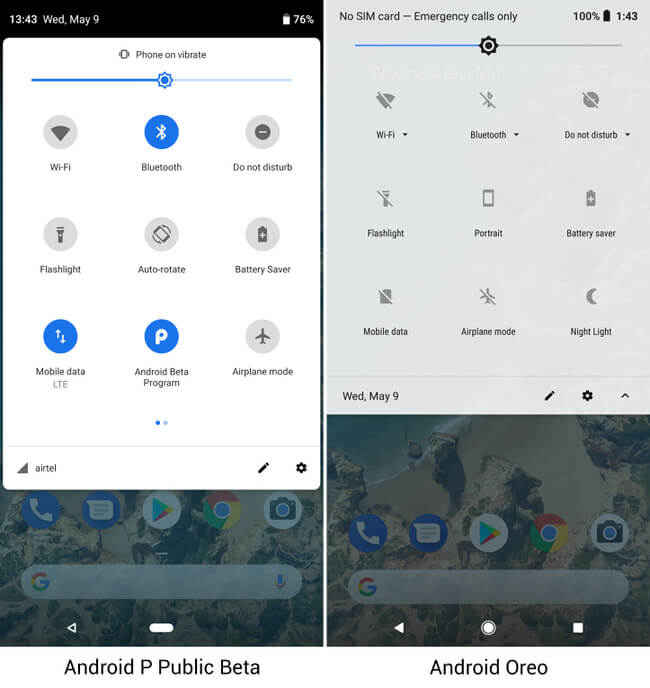
One of the first things that become apparent is that the Quick Settings menu has received a notable redesign. The first pull gives you access to the most common shortcuts, but the look has changed. There’s still the white background, but instead of it being translucent (in Android Oreo), it is now a solid white box with rounded edges. The setting buttons themselves now have a circle around them clearly marking each button. Toggling a setting on will turn it blue and turning It off greys the setting. This is different from Oreo. Pulling the tab further down reveals the entire quick settings menu which follows the same design principle as the preview. Solid white background with round buttons that are grey for settings that are turned off and appear blue for settings that have been toggled on. Even the Accept and Decline buttons that pop up when your phone is unlocked have been redesigned.
Redesigned navigation, optional
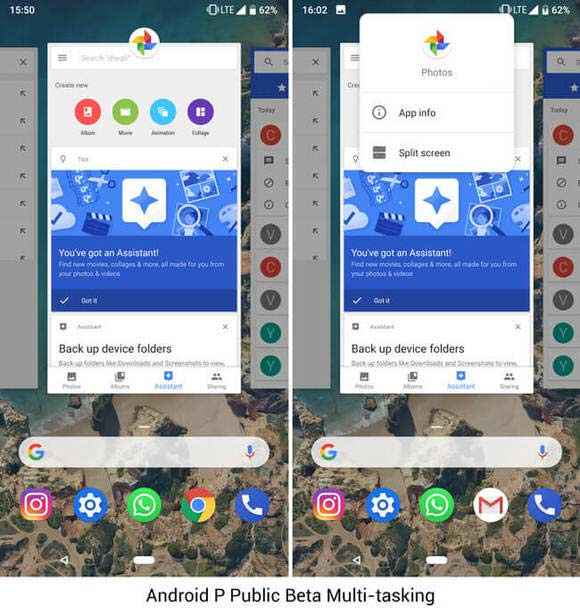
Now there had been rumours that Google was going to bring iPhone X like gestures to Android P for navigating the UI. Looks like the rumours weren’t that far of. We did get to see very similar gestures during the demo at I/O, but after installing the Android P Public Beta, I realized that there is a lot more to it than meets the eye. For starters, right after installing the beta, the navigation didn’t change. Turns out, the new navigation has to be enabled from the Gestures menu. I cannot even begin to express how amazing it is to have a choice between the old and new navigation. What’s good is that you can simply just drag the white bar at the bottom left or right to scrub between apps. If you just swipe up, the multi-tasking window opens first. If you’re looking for rhe app-drawer, you’re going to have to swipe up once more. This bit feels a little unnecessary, seeing how there are now two steps to get to a feature which previously only needed one step. Regardless, this is something you can grow accustomed to over a period of time.
Interestingly, the Public Beta of Android P is missing the “close all” option in the multi-tasking window. Either Google is extremely confident about the RAM management in their upcoming software, or it’s a feature that may have just got missed. What was quite surprising being the resemblance Android P’s multitasking interface shares with that from the now defunct Windows Phone. For what its worth though, the entire thing works extremely smooth on our Pixel 2 XL, despite being a beta version of the software.
New battery management
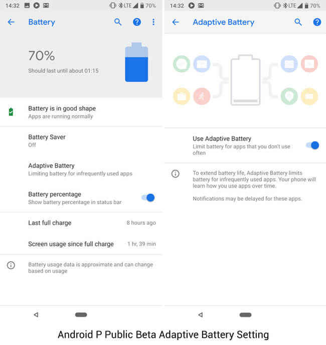
Of the many things Dave Burke spoke of, he started with how the Android team had collaborated with the Deep Mind team to come up with an AI algorithm that would better optimize battery life. The result of that collaboration is the new Adaptive Battery setting within the Battery options. This is essentially an AI-based feature which monitors apps usage and then limits the background calls by apps that are not frequently used. By doing so, it prevents the CPU from being woken up by unnecessary apps, consequently preventing battery drain. This feature will become better over time as the AI learns your usage behaviour, so I can’t really say if it is working for now or now. In fact, it is only when Google ships the final build of Android P is the only time when this feature should be gauged as beta builds tend to have a host of issues that can adversely impact battery life.
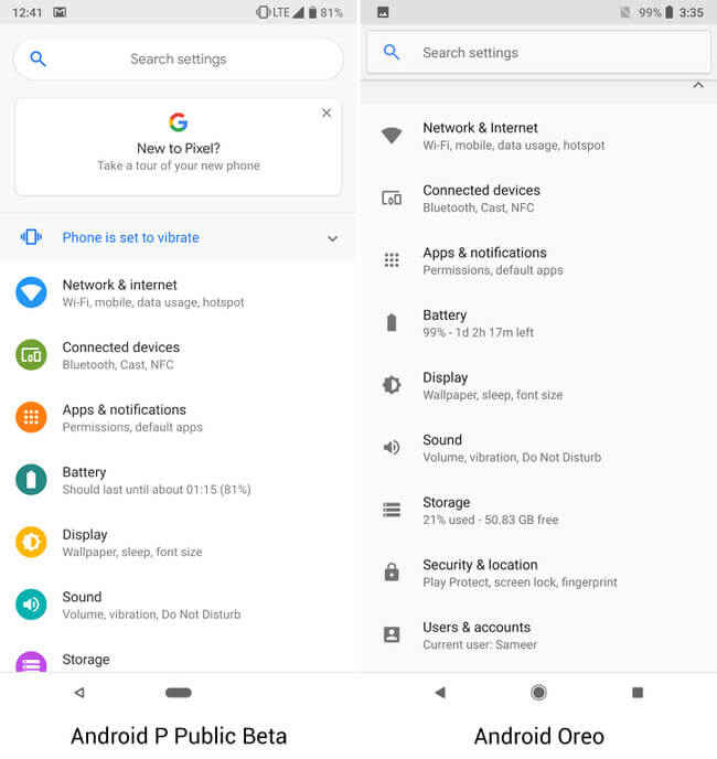
A new look for settings
While features and settings may not be very obvious at the very beginning, the looks of the OS will definitely stand out. The settings menu has also been visually redesigned, with new icons and a more colourful theme. You will also notice that a lot of the sub-menus have been optimized and many sub-options getting put under the ‘Advanced’ sub-menu for each setting. This is pretty handy, but if you’re not the kind who likes jumping between setting screens, you can always just search for whatever it is you’re looking for. The new colourful look of the menu matches the Android P splash screens you’ll see when you repeatedly tap on the Android version text. This could be a hint to the final name of Android P.
Slices and App Actions
Slices and App actions are two new ways that Google is enabling a new way to interact with apps that are already on your phone. App actions will surface in the app-drawer based on what you do the most within apps you use most frequently. Those “actions” will show up at the very top of the App Drawer, a rather convenient way to do certain things. For example, for me, the action of calling a particular contact popped up, right next to a “Slice.” Slices are essentially miniature snippets of an app, tapping on which will open the app to the screen from where it was pulling the mini preview.
The feature I was most excited to test-drive, the Android Dashboard, is not yet available in the beta. Android Dashboard is Google's attempt at bringing mindfulness to our smartphone usage, by showing us what apps we spending most of our time on. It's essentially a way of shaming you into using your phone more judiciously. Other than that, Android P is riddled with minor tweaks and changes numbering so many that it won't be possible to sensibly fit them all into one story. We will keep pushing out more content around Android P and its features and functionality as we test it. In case you can't wait, here's how you can get the update on your eligible device. To get the update on the Pixel devices, users will need to enrol in the Android Beta Program and wait for the update to roll out. For other devices, the update needs to be flashed by downloading the file from the Android Developers blog. Be warned that the update might void the warranty and you might not receive customer support if you are on the beta version. The update will definitely prevent you from receiving the monthly security patches Google issues.
Swapnil Mathur
Swapnil was Digit's resident camera nerd, (un)official product photographer and the Reviews Editor. Swapnil has moved-on to newer challenges. For any communication related to his stories, please mail us using the email id given here. View Full Profile


