Why are major tech companies changing their logo?
Does changing a company's logo really make any difference in its fortunes?

After Google changed its logo – boy, were there waves! Not destructive, landscape altering waves, but waves that push you just enough to make you lose balance.
Google changed its newspaper-reminiscent typeface in September with that of a child who was let loose with a crayon and a penchant to watch the world burn. The quaint looking lowercase ‘g’ present on all our tabs turned into a multi-coloured, grotesque uppercase ‘G’. Gmail would never be the same again.
Or so we thought, and always do when a logo of a brand we know and love changes. There is confusion at first, then anger, and then, after a healthy amount of ranting on the internet, we make peace with it, as usual. The old logo already begins to look outdated, and we decide to get on with our lives.
And so the question arises
Do these logo changes really mean anything? Under all that marketing jargon is there something of value being carried out here or are we at the mercy of bored designers and fidgety brand managers?
Take, for example, Quora, the forum of intelligent or at-the-least earnest procrastinators where questions can be asked and interesting answers expected. When Quora changed its logo, it looked like it hardly changed anything. The tip of the Q seemed longer and the ‘r’ had become rounder. That’s it. You might wonder why anyone was paid to do this – and you would stumble across a lengthy explanation for it.
The logo was changed because the ‘r’ and the ‘a’ met at a weird angle, the logo looked cluttered when it’s size was reduced, and because there was a lot of ‘noise’ in the logo, among other things. Noise here is the unevenness of the top of the letters of the old logo which doesn’t allow your eyes to travel smoothly over it.
But there was an angle of manipulation too in all this! The new font used here was Baskerville, a font which, filmmaker Errol Morris concluded with a convenient social experiment, that “promotes, engenders a belief that a sentence is true,” which means that you now are in possession of a very useful life hack.
These do sound like good enough reasons which could seep into our minds slowly over time and thus be significant.
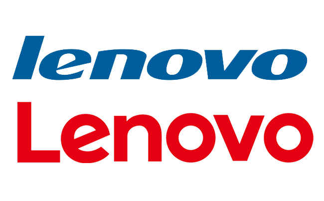
Lenovo's 'new' logo
But then what about the new Lenovo logo? This new logo looks very similar to its previous one at first glance, with the prominent change being that the font is no more in italics. The company says that it now looks more personal. Yes of course, of course it looks more personal. But the important part here is that the logo is now enclosed in a rectangle, which can be filled with any image by its partners. That is a more tangible outcome of reworking a logo.
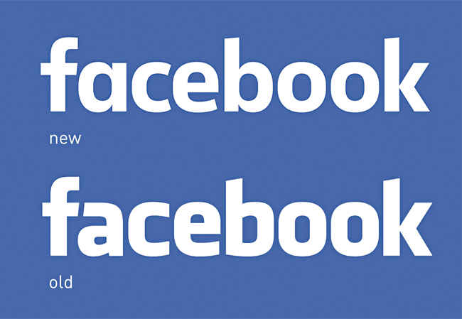
And then we come to Facebook’s new logo. Hold the two logos aside and try to spot the difference. We’ll wait. Facebook here turned the two-story ‘a’ to a one-story ‘a’, and made the letters a bit thinner. They did it to make the logo “approachable and friendly”. So now you know who to turn to when you’ve had a bad day.
Sheild your eyes from this drastic change!
Isn’t this marketing speak?
Before you dismiss all this hoopla and begin to believe that these logo changes are merely the experiment of a restless imagination, you may witness the buzzword for any new logo-nowadays – it’s mobile-friendly.
Logos of technology companies are going the simple, flat, and thus more mobile-friendly route. Flipkart changed it’s logo from the shopping cart racing past to its iconic ‘f’ on a shopping bag to make it more mobile-friendly. Google changed its logo to also make it more flat, and clean, and thus more mobile-friendly as the previous logos were designed keeping desktops in mind. The Lenovo logo too was changed to make it more (déjà vu), mobile-friendly.
And this trend, some believe, is taking the fun out of the logo world. Shadowing has been stripped off, nice round buttons which actually look like they can be pressed have been stripped off, and we are witnessing the shift from skeuomorphism to the commonly seen flat design which began around 2012.
Skeuomorphism, for the unfortunate reader who did not undertake a career in design, is the style of making digital items and prompts look like their real life counterparts. For example, when a folder icon on the computer looks like a real, physical folder – that’s skeuomorphism. When a modern day car has wood panelling applied on its sides to make it look like a vintage car, that’s skeuomorphism. When the camera of a phone makes a click sound on taking a picture, a sound it logically does not need to produce now, that’s also an example of skeuomorphism.

Skeuomorphism. More pretty than important
We don’t want pretty anymore. We want something that works. And that is why the designer and the engineer don’t look eye-to-eye anymore. A thought that is slowly gaining traction in the design world is that this phase of design is not a phase which will be remembered for its innovation, but of the phase where everyone went “Let’s make it simpler” instead of “Let’s make it cooler.”
But isn’t that a good thing? Why on earth would we care about how that facebook logo looks as long as the service still remains the same. Isn’t it better when an application opens even 1/4th of a second faster because of a simpler interface? Or look at it the other way round. Nobody wants to wait a second more to open the same service packed in a prettier package.
That doesn’t mean that all these tech companies are doing is making their logo mobile-sociable. Take, for example, the heart-attack inducing Oculus Rift’s creator Oculus VR. Oculus had a very interesting eye next to it’s name in the logo, which signified virtual reality. Unfortunately for it, it also looked like the ever watchful eye of Big Brother. So they took out the O of Oculus, flattened it, and presented it saying “ Here. This is the new logo.” The interesting part is, the logo now also looks like a headband, reminiscent of the company’s product which made the most noise, the Oculus Rift.
And in one of the saddest but more ingenious logo changes is Quirky, an organisation which serves as a platform for inventors and companies to connect. The company changed its earlier almost scribble like logo to a remix of the symbol ‘&.’ Now when the company has to display on its website a collaboration between an inventor and a company, it says “Inventor ‘&’ Company.” That’s pretty cool.
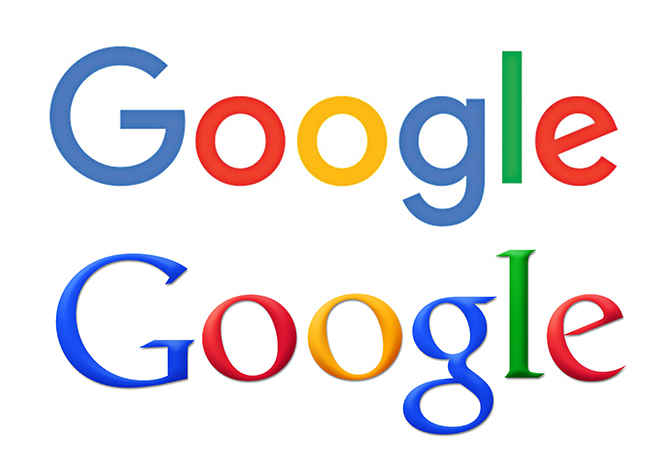
The new, and mostly hated, Google logo
Why do brands change logos?
There are more reasons for a brand to change a logo. A brand wants its comical look to be turned into something more serious. A serious look wants to be more friendly. A friendly look wants to be serious too. A friendly look wants to be the brand-next-door type of brand. The list is endless.
A brand will change its logo to give a better idea of what it’s products now deliver, or what the brand wants you to think its product now delivers, like how Flipkart changed its logo to reflect a brand which sells a variety of items and not only books. It will change its logo because what was cool yesterday looks lame today, like how Yahoo changed its yodeling font to something a bit cleaner. It will change its logo to reflect possibly a new ownership, like how the font of Motorola’s logo looked more ‘Googley’ when it was acquired by Google, before Lenovo bought it of course. An even more appropriate example of this would be Zomato.
Zomato changed its fork and heart logo to a spermesque spoon logo after acquiring the US company Urbanspoon. Why did Zomato change the logo to look like what it acquired? So that the 40 million users of the Urbanspoon would not wake up one day and see some strange app on their phone which they would promptly uninstall – at least it looked similar.

Zomato's current logo
Brands will also change their logo to try to shake off the fact that everybody thinks of them as a dinosaur on an intravenous – this is clearly not a reference to AOL’s logo change way back in 2009.
Sometimes, however, we stumble across companies which have kept the logo as similar to their original one as they could.
Hewlett Packard has had that familiar ‘HP’ in its logo for decades. Even after it has decided to split up into two companies, the one handling the computer business still has that iconic ‘HP’. IBM too has not made any major changes to its logo since 1947, sticking to its three letters, and since 1971 has stuck to its window-blind look, a look which means speed and dynamism. That is what we were told anyway. Even Intel has just played around with the placement of its logo since inception, taking the ‘inside’ outside and sprucing it up a bit. Despite the changes, the feel of the logo and the familiar unfinished circle remained.
So what does it all mean?
Well, an irreverent conclusion is that logos are like clothes. They give an idea about what the company, (or in this metaphor the body if you were paying attention) wants to look like. So does a different outfit really make that much of a difference? Because underneath the shift from pastels to bold or checks to stripes, what matters is whether the garment still fits right and does its innate job of covering the parts you’d like covered. But wait, hold that thought – does only size matter? Don’t we always pick that black shirt because it does wonders in covering up that beer belly? Doesn’t a Palazzo cut ingeniously cover that skinny frame?
To answer that question, have a look at our previous magazine issues. Did you notice the number of times we changed the logo on our cover page?