Designing your first app

I have been a developer for a long time now, and pretty hard-core by most standards. I’ve hand-written complex algorithms back in the days when I was neck-deep in image processing. Machine learning, artificial neural networks, fuzzy systems – I carried a bunch of research papers on these in my bag like a woman carries…ok I don’t know what all a woman carries in her bag, but you get the drift.
 Survey
And then, for the first time ever, when I tried to edit a CSS stylesheet for an app (or my first blog?), it was like coming face to face with kryptonite. With my design and front-end skills that were no better than a monkey (maybe worse), I had a hard time putting together a good experience.
Let’s say you have a side-project or an alpha product you want to put out there and test your hypotheses. Maybe you’re an ace programmer, but your knowledge about interface or user-experience design is no better than your knowledge about Swahili. Assuming that you can’t (or don’t want to) hire a UI/UX designer at this stage, these tips will help you put together a decent, if not award-winning, user experience.
Hacking through design
Design is a very broad term — it covers everything from the overall flow of your application to tiny details like the colour of the shadow of the border of the button. These are some things I’ve learnt first-hand, and that are most effective if you apply them before you start coding the app.
Find your flow
It is important to mock-up the “pages” or “views”, along with the major elements, to come up with a flow that makes it most easy for someone to find his/her way through the most important tasks your app helps accomplish.
One classic mistake is to design the flow and elements from your perspective, rather than a user’s. If the objective is to collect a lot of user information, the login form resembles a passport application. I personally feel that you should sacrifice your objectives whenever they conflict with the ease and convenience of the application. For example, if you’re using Twitter OAuth based login, don’t ask for an email and/or password in the next step if you can help it.
Find the shortest path a user can take to do what he came to do to with app; make his or her life super easy.
Lose the fat
When Radbox first went live there was no way to reset a password if a user forgot it. Among hundreds of users at that time, one guy mailed us saying he’s forgotten it and can’t find the link. We helped him reset his password manually at that time, added the link in a subsequent build. Radbox also allows users to use fake emails, there’s no verification. This reduces the gap between hitting the sign up button and diving into the application.
These examples may sound extreme, but it goes to show how minimal a minimum viable product can get. When designing your workflow try to keep things light and quick, especially if this is your first alpha version.
A corollary here is to make sure all leaks are plugged. I’ve used applications where I’ve ended up on dead-ends, with no navigation to where I want to go next, other than hitting the “back” button or manipulating the url in the browser’s address bar. Avoid such dead-ends.
Empty pages make least noise
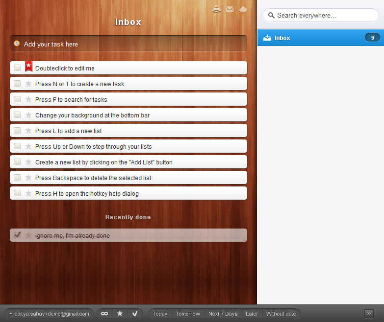
If you sign up for a new Gmail account, you see two (or three) new emails in the inbox welcoming you to Gmail. For many apps that rely on a user adding or receiving items like email, news articles, a to-do list and so on, it is a good idea to seed some items, as against launching a blank application.
Of the many flaws of the current form of Radbox is that there’s no seeding of videos, which will be fixed in the next release. So yes, I practice what I preach.
Buy some clothes
Assuming a plain-looking application with seed data is in place, you need to dress it up (alternately you want to start coding with a good theme for your app). Being a non-designer, start with a free or paid CSS theme available on one of the many sites like themeforest. It is a quick and effective way to give your app a decent theme. If you like the interface of Twitter, you can start with Bootstrap, open-sourced recently. These options make it easy to offer a nice, consistent theme for your app.
Be careful about the licenses. Some authors require you to credit them for their work, and you should totally do that. This also holds for any icons you use in your application. Repeat after me: “I will respect all copyright and licenses for any themes, icons or graphics I use”.
In the process of tweaking the stylesheet to meet your needs completely, you should pick up enough CSS to get by. There are plenty of resources on the web to help you with that. There’s no avoiding this, and it is not that hard really.
Easy on the make-up
Just because you’ve learnt CSS and jQuery and can make elements dance around the page doesn’t mean you should. Resist the tempation add a shadow or border to everything because you can. Keep it subtle.
Build. Test. Repeat.
Test your app in different browser and operating system environments. There are plenty of tools like Adobe Browser Labs, some paid others free. Remember that initially it is important to focus on browsers and OS that your early adopter audience tends to use, if you must choose between being 100% consistent versus watching a movie.
Get a (free) professional opinion
There are people in the tech community who’ll be happy to test-drive your application. You can reach out to some of them directly, at meetups, or on online communities. Get feedback, and if something really resonates go ahead and fix it. Be open enough to consider every opinion, yet smart enough to know which ones you should actually act upon.
Closing thoughts
This has turned out to be one of the longest posts I’ve written, and yet I’m no authority on design and by no means this is an exhaustive guide to anything. In the long run, it helps to actually learn the basics of user experience (UX) and user interface (UI) design even if you engage with a professional designer later. Being ignorant will not only make your product less interesting, it will cause problems when you communicate with your designer, and the result will be frustrating for both sides (true story).
I’ll end this with some tools and resources you should find useful. Have fun!
Tools and Resources
- Mockingbird – my favorite tool for mockups.
- Clean the mess – a nice guide to understanding visual design for beginners.
- Smashing Magazine – you should be reading this regularly.
- The Noun Project – free icons for commercial use.
- Does Ruby on Rails affect how a web page looks? – epic response on StackOverflow.

.png)